Our Favorite Paint Colors
- Lucie Ayres
- May 21, 2020
- 2 min read
Updated: May 26, 2022
SUMMER begins this weekend officially – a colorful time of year- all those flowers - and also one of the busiest time for many interior designers. It’s that REFRESH MY SPACE moment. Sure, you can add some new throw pillows into the mix (new pillows are NEVER a bad idea) but if you REALLY want to update a space – it’s all about thinking about your walls… particularly the paint color. That much might be obvious, but what’s not obvious is the type of paint you buy.

We relate to this New Yorker article - it addresses the high anxiety levels people get about choosing the right paint color, because it’s about much more than just the color – it’s about the light, the furnishings, the colors of the other rooms, the mood you want to evoke… so much to consider.

One of our favorite paint companies for color is an Australian company called Drikolor. Their paints are the truest, deepest, richest colors I have ever seen. They don’t use more than 12 ingredients per color and all the ingredients are RAW NATURAL MATERIALS – as organic as you can get.
After reading Kassia St. Clair’s brilliant must-read book The Secret Lives of Color, it’s clear that creating a perfect hue is not an easy process (bugs, urine, bone…it’s fascinating how paint colors were created and when, historically speaking). A perfect color can transform a space – and the way you FEEL.
Here are a few favorites:
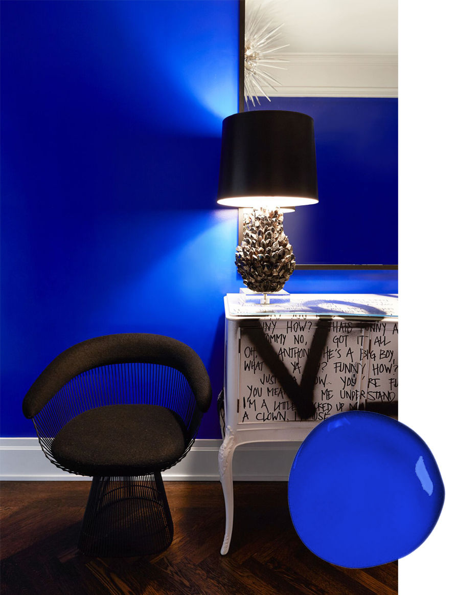
ULTRAMARINE
This color is so perfect, the French artist Yves Klein tried to get patented. It’s rich and bold, it seems to pulsate on the wall from its own energy
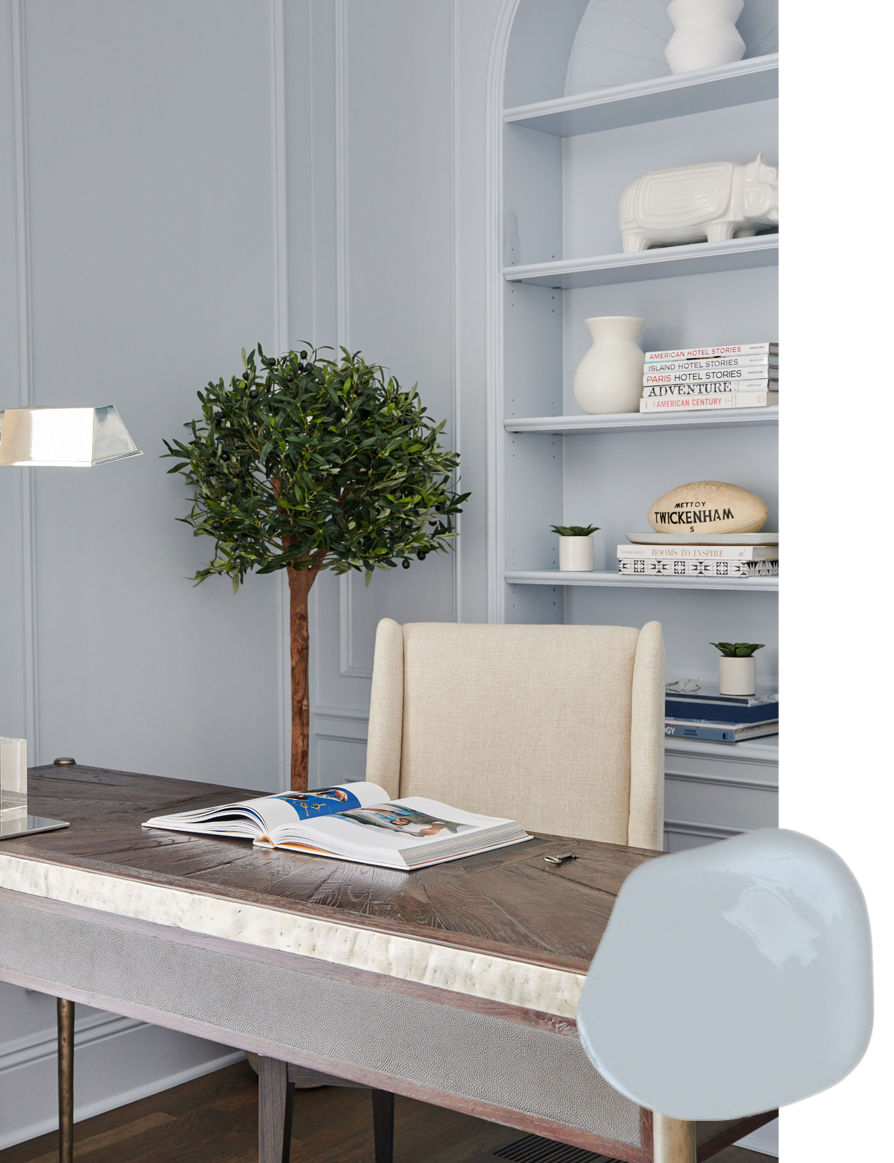
CAESIELLUS
We also love the soft hue of Drikolor's Caesiellus. It's a beautiful blend of blue and grey and a classic color that will stand the test of time.
Another one of our favorite paint makers is Farrow & Ball. They offer highly pigmented colors in water based paints that are low odor, eco-friendly and safe for you and your family to use in every room of the home. Their paint tins are also recyclable, and you know we appreciate a sustainably focused company.

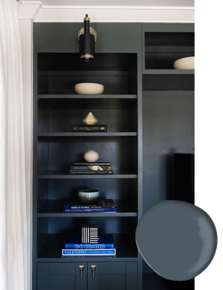
DOWNPIPE
Farrow & Ball’s Downpipe is a chameleon shade that looks grey in one light and teal in another. It's moody, intriguing and a great choice for accent walls and built-ins.
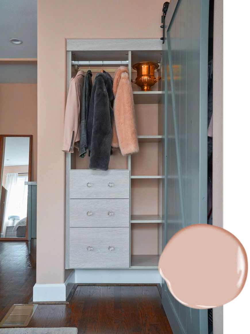
SETTING PLASTER
Farrow & Ball’s Setting Plaster is a perfect blend of feminine and classic. It's not pink, it’s not peach, it’s an old world color that is warm yet compliments gray so well.
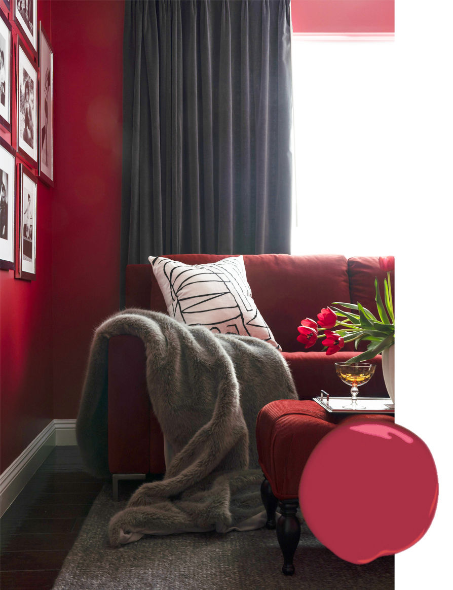
RECTORY RED
Rectory Red by Farrow & Ball is another beautiful, bold color that is romantic, warm and invigorating. It's great on furniture to add a pop of color or an adventurous selection for a wall color.

Hope this gets you inspired for your next painting project!




Comments