
A spectacular WeHo condo remodel
- Lucie Ayres
- Oct 16, 2019
- 2 min read
Updated: Oct 21, 2019
Our so fabulous (and young! and handsome! and smart! I'll stop now) clients are bicoastal and absolutely love the condo building they are in - it's in a prime location in West Hollywood and has all the charm of a Los Angeles mid-century small condo unit - a courtyard with a pool and neighbors who enjoy each other's company. But they felt they wanted extra space, which is why when their next door neighbor decided to sell his 2 bedroom, they jumped on it (their former place was a one bedroom). The unit needed everything to be upgraded - or rather - gutted and remodeled. We wanted to open up the space so we did the classic of removing a wall separating the kitchen from the living space.
Take a look at the before pictures to get a sense of what we were working with:


Our first order of business was to create a functional layout of the space and figure out how we could max out the small space for optimal comfort. We decided to combine the kitchen island and dining table so we could use the entire back wall for kitchen counter / storage space. You'll notice a post that comes down onto our island. This was not part of our original design, but a compromise we had to make since the previous wall was load bearing.
Here are the after shots of the living, dining, kitchen space.


We also added a fun bar for our clients who enjoy a lovely post work week cocktail.

We also took advantage of the entry wall to create a spot for coats, shoes, and mail.

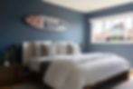
For the bedrooms, we were able to reconfigure the layout to get an extra foot into the master bathroom and create an ensuite vs the original layout where both bathrooms were accessible via the hallway. In the master, we choose Henry by Drikolor. The white we choose throughout the home is Simply White by Benjamin Moore.
Master bedroom features a fun Keri Rosenthal surfboard piece above the bed. Furniture by Huppe.
Master Bathroom - we decided to have some fun with the tile - a random pattern of blues and grays to give the smallish space some character.

Guest bedroom/ office - the wallpaper by Innovations made it extra cozy.

Shelving and desk unit by Huppe.

The below shows details of our client's Robert Maplethorpe triptych. Sleeper sofa by American Leather company.

And finally the guest bathroom - we were able to expand it by getting rid of the linen closet in the hallway so this smaller bath had a bigger shower space. All cabinetry custom. Art below by Shana Frase.

Tile by Walker Zanger.

And finally a happy moment in the living room - swivel chair by DWR and "Candy Bomb" print on wall in background.

Thank you for looking and reading!
Until next time -
Lucie + team 22 ID
Photography by Annie Meisel.